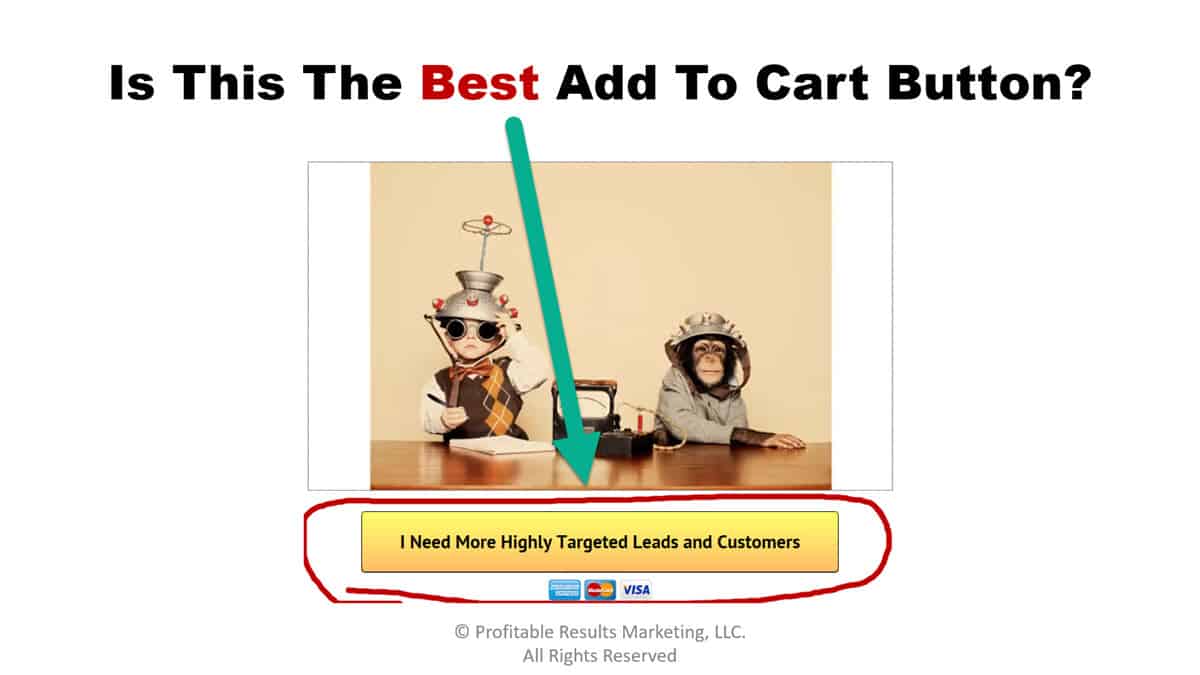
“I was able to increase my sales by 397.11% by making this one simple little change to the Add To Cart Button…”
People are always asking me what the best Add To Cart Button looks like (the one that gets the highest click through rates and produces the most sales).
They are searching for that single most-magical “Add To Cart” button that they can simply slap on all of their sale pages… and it will generate maximum sales in the shortest time possible… no matter what that product is.
Well, I’ve got some bad news for those people, because…
There is no such thing as the “best” Add To Cart Button that will work in any situation… it just doesn’t exist!
The best “add to cart” button that worked for someone else, or even for you last week… isn’t necessarily going to be the “best” button for you to use the next time.
The simple truth of the matter is that if you are using the same “Add To Cart” Button on all of your sales pages, then chances are you’re leaving some serious cash on the table by missing out on sales that you could have easily captured if you would have spent just 10 minutes doing applying just a few of the 7 Add To Cart Button design tips that I’m about to share with you.
Here’s what I’m talking about:
I was able to increase my Video Sales Letter (VSL) conversions by 397.11% by making just one small little change to the Add To Cart Button that appeared just below the VSL.
And that was on top of the 103.43% improvement I had already made to my Video Sales Letter conversions during an earlier A/B split test.
Just to be clear about this…
When I say I increased my VSL conversions by 397.11% I mean I was able to quadruple my sales by making just one simple, small little change to my Add To Cart button.
Would you like to know what that one small little change was that increased my sales by a factor of 4?
Here it is:
I took our previous winning button design and tested three new versions against it in an A/B split test.
The only thing that I changed for each of the new buttons was the “Call To Action” phrase that was printed on the button itself… every other aspect of the button design remained the same.
In the end the winner beat the control by 397.11%.
Once again…
The only difference between the buttons was the “Call To Action” phrase that was printed on the button.
The winning Add To Cart Button had the phrase “I Prefer To Save 50% By Joining Right Now Before The Price Doubles!” printed on it .
That’s it… simply changing one little phrase made all the difference in the world when it came to putting more money in my pocket… and I’m positive it can do the same for you.
Here’s the best part:
The entire A/B split test took me less than 10 minutes to set up yet it helped me increase my sales by 397.11%.
I’d say that’s a huge return on investment, and I’d like to help you do the same for your business, so…
Here are 7 tips to help you improve your ATC button conversion rate:
- You should constantly split test new Add To Cart button designs.
- Test a different button design for each unique source of traffic (i.e. traffic from Affiliates vs. PPC traffic, etc.)
- The phrase “Add To Cart” has never been a winning phrase in any of our tests… so, don’t waste your time testing it over and over again. If you beat it once, simply move on and don’t bother testing it again.
- Test phrases in your button design that reinforce the primary benefit of your product, or the most powerful “hook” from your headline (i.e. “I Want More Traffic And Leads!” was a winner for my Tube Traffic Secrets.)
- Test phrases that help you introduce urgency or scarcity to your offer (I always say… “the only thing that converts better than an offer with urgency, is an offer that has both urgency AND scarcity.“)
- Test phrases that talk about any special bonus or discount you may be offering (e.g. Lock-in The Biggest Discount Before It Expires – Click Here!)
- You should constantly split test new Add To Cart Button designs (this one was worth repeating).
So what are you waiting for…
Start Split Testing Your “Add To Cart” Buttons Today!
Now that you know how to design the best add to cart button, here’s how to design the perfect opt-in page… step-by-step.

Leave a Reply